Back to all work
Case study · 2023

Words Without Borders

Eye-tracking research that turned a clunky mobile experience into a clear path to global literature.

About the project

Meet Words Without Borders

Words Without Borders (WWB) is a digital magazine that amplifies global literary voices, publishing translated works from diverse authors and cultures. Its mobile site is the gateway for readers to discover international literature, both renowned and emerging.

My role

UX Designer & Researcher

Ran eye-tracking sessions, synthesized behavioral and analytics data, and turned the findings into a research-backed mobile redesign.

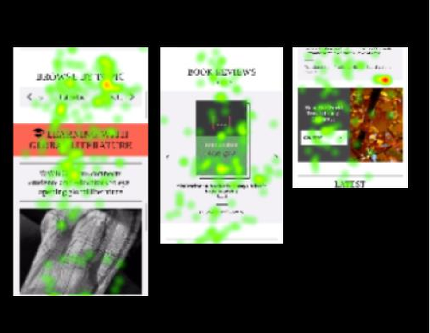
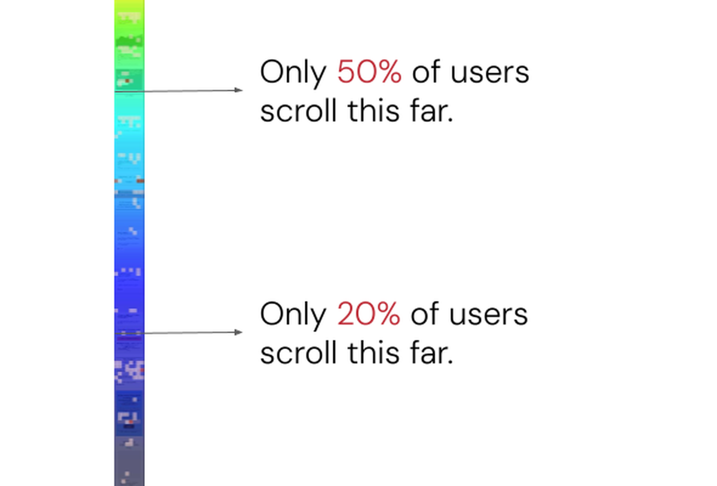
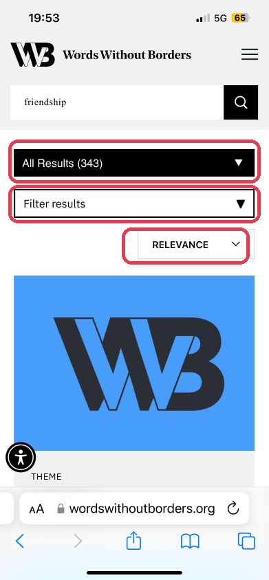
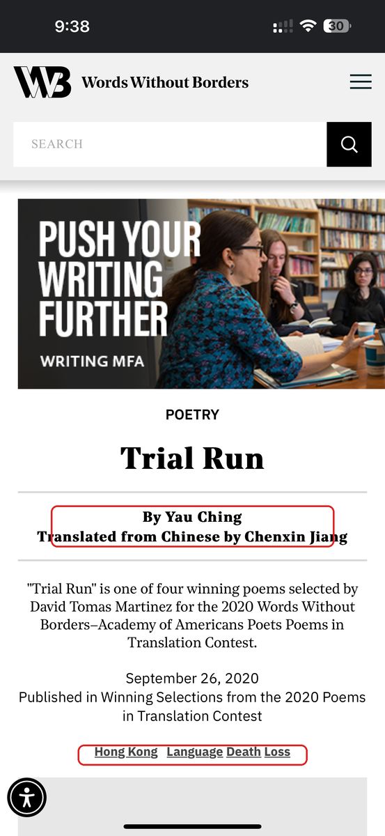
  • Designed and moderated eye-tracking sessions in the Pratt Usability Lab using Tobii Pro
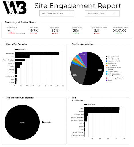
  • Analyzed Google Analytics + Hotjar to triangulate user behavior
  • Translated friction points into five targeted design recommendations
  • Wrote a final usability report adopted by the WWB digital team
Impact

Measured & validated

30% Bounce reduction
25% Navigation efficiency
+40% Discoverability

The redesign cut bounce rate, sped up navigation, and surfaced multilingual content users couldn't find before.

Client

Words Without Borders

Digital magazine for global literature

Timeline

4 months

Sept – Dec 2023

Team
  • 1 UX Designer + Researcher (Me)
  • 1 Visual Designer
  • 1 UX Data Analyst
  • 2 Developers
  • 1 Content Designer
  • Stakeholders
Toolkit
  • Figma
  • Tobii Pro Lab
  • Hotjar
  • Google Analytics 4
  • Google Suite
  • Slack
Why mobile?

Half the audience came in through mobile, and mobile was where the experience broke down.

206.7K of WWB's 417.2K users visited on mobile, yet every key engagement metric trailed the combined-device baseline. The desktop site felt finished. The mobile site felt unfinished. That gap is what this study set out to close.

58.1 Mobile SUS Sits below the 68 industry benchmark. Desktop scored 78 on the same scale.
60% Bounce rate Mobile bounce vs the 51.6% benchmark for the category.
1:47 Session duration Mobile sessions, vs 2:34 combined across all devices.
40% Engagement Mobile engagement, vs 46% combined. July 2023 – March 2024.
The problem

Users struggled with clunky navigation, weak search functionality, and low content visibility, making it difficult to explore the stories the platform aims to elevate.

…leading to high bounce rates and missed content across the mobile experience.

Problem 01

Navigation lacked a clear anchor.

Eye-tracking showed scattered gaze, no dominant entry point.

Eye-tracking heatmap showing scattered gaze patterns across Browse by Topic, Book Reviews, and Latest sections on the WWB mobile homepage
Scattered gaze
Problem 02

Homepage overwhelmed before it informed.

60% bounce rate. Only 13.8% reached the bottom.

Hotjar scroll heatmap showing only 50% of users scroll past the first fold and just 20% reach further down the WWB mobile homepage
60% bounce
Problem 03

Multilingual was hidden in plain sight.

Only 37% could locate it. Most misread the tag.

Misread tag
Problem 04

Article pages broke at the edges.

Links looked like text. Just 25% knew what was tappable.

Links unclear
The solution

A mobile experience that makes global literature discoverable and inclusive.

A research-driven approach across navigation and search, content visibility, multilingual discoverability, and the article-level experience where exploration actually happens.

Reorganize the homepage

Clear sections, trimmed metadata, 3–4 cards per screen.

Simplify navigation & search

One unified filter. Predictive search. Learn as its own tab.

Make multilingual visible

Explicit language labels — French, Chinese — on every card.

Strengthen article pages

Underlined links, spaced credits, sort-by filters on genre pages.

The process

A four-stage research approach.

01 Discovery
Week 1–2
  • Stakeholder alignment
  • Research objectives
  • Mixed-method plan
  • Usability questions
02 Testing
Week 3–6
  • Participant recruitment
  • Eye-tracking sessions
  • Think-aloud protocol
  • SUS + post-test feedback
03 Synthesis
Week 7–10
  • GA4 baseline metrics
  • Hotjar heatmaps
  • Behavior + perf cross-cuts
  • Friction prioritization
04 Recommendations
Week 11–16
  • Usability report
  • Design recommendations
  • Before/after concepts
  • Stakeholder handoff
01 / Phase One

Discovery & Planning

Aligning on goals, defining the questions, and choosing a mixed-method approach to study mobile behavior.

Stakeholder Meeting

I met with WWB's Digital Director and editorial team to align on research goals, content priorities, and success metrics for the mobile experience.

01

Improve navigation & search discoverability

Make it effortless to find specific content on a mobile-first browse.

02

Increase engagement with multilingual & editorial content

Surface translated work and editorial features that were buried in the existing IA.

03

Reduce bounce rates & improve scroll depth

Tighten the homepage so readers stay long enough to discover something worth reading.

Research Goals & Questions

Three focused goals and the questions that drove every session.

01

Understand mobile navigation behavior

Where are users focusing most on the homepage, and what's pulling their attention away from the navigation?

02

Identify friction in search and filtering

Are users confused by the “Multilingual” and “Learn” tags? Do they expect filtering before or after search?

03

Diagnose bounce-rate issues

What causes users to exit early, and which content moments would have kept them scrolling?

Research Plan

A mixed-method approach combining behavioral data with direct user feedback.

Quantitative

GA4 + Hotjar

Performance baselines — bounce rate, scroll depth, session duration — plus heatmaps and scroll maps to visualize attention and drop-off.

Qualitative

Tobii Pro + think-aloud

Moderated eye-tracking with task-based exploration. Think-aloud protocol captured live frustration. SUS + open-ended feedback closed each session.

02 / Phase Two

Behavioral Usability Testing

Mobile eye-tracking sessions in the Pratt Usability Lab. Real users, real gaze patterns, real friction.

Usability Testing: 8 Participants

Recruited a mix of new and returning users who reflect WWB's mobile-first, global audience.

06

New Users

First-time visitors recruited via the WWB newsletter, social channels, and the Pratt network. Age 18–32.

  • First impression
  • Homepage scan
  • Multilingual discovery
02

Returning Users

Graduate students and literature professionals already familiar with the existing site.

  • Search habits
  • Content depth
  • Mobile parity

Eye-tracking testing setup

Moderated mobile sessions at the Pratt Usability Lab using Tobii Pro Lab. Pre-test (5–10 min), task execution across Homepage / Search / Multilingual (15–25 min), post-test SUS and open feedback (10–15 min).

Location

Pratt Usability Lab

Method

Eye-tracking with think-aloud

Avg. Session

45–60 minutes

Software

Tobii Pro Lab

Captured

SUS score, time-on-task, task success

Survey

Google Forms post-test feedback

Sample eye-tracking session · Tobii Pro Lab · Pratt Usability Lab

Initial measurement & metrics

The baseline scores set the bar — and surfaced exactly which behaviors needed to change.

Effectiveness 72% Task success rate across all 4 tasks
Efficiency 12:26 Avg. total task completion time
Satisfaction (SUS) 58.1 Below the 68 benchmark · desktop scored 78

Task breakdown

A more granular look at the four tasks. Each focused on a specific feature of the site, so we could pinpoint exactly where the experience broke down.

Task 01 · Homepage 8/8 3:36 avg time · ease 5/5
Task 02 · Multilingual 3/8 2:42 avg time · ease 3/5
Task 03 · Search 4/8 2:11 avg time · ease 3.5/5
Task 04 · Article 8/8 3:57 avg time · ease 2/5

What worked well

Not everything was broken. Three things landed for participants and shaped what we kept in the redesign.

Aesthetics

Visual style read as trustworthy

8 of 8 enjoyed the look. Style signalled credibility on first scan.

"This looks very professional, I'd think this is a reputable source."

Search filter

The filter idea itself worked

6 of 8 liked the filter. The idea landed — the placement didn't.

"The filter style looks clean and clear, I like the option to filter by languages."

No paywall

Open access reinforced the mission

Every participant valued the no-paywall model.

"I appreciate not having a paywall, knowledge should not be priced."

Key behavioral observations

Four patterns repeated across every session.

Observation 01

Homepage engagement was low

Only 2 of 8 scrolled to the bottom. Drop-off after 1–2 folds.

"There's too much going on. I don't know what to focus on first."

Observation 02

Multilingual content was hard to find

Only 3 of 8 found multilingual stories. Most read the tag as a translator.

"I thought 'Multilingual' would translate the article, not show different languages."

Observation 03

Search & filtering lacked intuition

Filters weren't explained. Search lacked category guidance.

"I wasn't sure what the search was actually searching through."

Observation 04

Poor link visibility reduced exploration

Links looked like text. Eye-tracking caught hesitation and backtracking.

"I didn't realize the author's name was a link. It looked like plain text."

03 / Phase Three

Data Synthesis & Analysis

Cross-cutting the lab observations against GA4 and Hotjar to separate one-off frustration from systemic friction.

Quantitative insights from analytics tools

I pulled GA4 site-engagement data for the mobile audience and layered it against Hotjar scroll maps of the homepage. Two artifacts, one story: mobile readers drop early and bounce often.

Google Analytics 4 site engagement report for the WWB mobile audience showing 20.1K active users, 96% new users, 51% engagement rate, and traffic acquisition breakdown
GA4 site engagement report · Mobile · Mar 21 – Apr 19, 2024
Hotjar click heatmap showing dense interaction on Browse by Topic, Book Reviews, and Latest sections of the WWB mobile homepage
Hotjar click heatmap · Browse by Topic, Book Reviews, Browse by Country drew the most clicks
Hotjar scroll heatmap showing only 50 percent of users scroll past the first fold and just 20 percent reach further down the WWB mobile homepage
Hotjar scroll map · 50% reach the first fold, 20% go further

Where the lab and the data agreed

Four insights showed up in both the eye-tracking sessions and the analytics. When a behavior surfaced in both sources, it stopped being a hunch and became a recommendation.

Insight 01

Mobile attention dies after fold two

Gaze trailed off. Only 13.8% reached the bottom.

Insight 02

Multilingual is a vocabulary problem

Misread in the lab. Near-zero clicks in Hotjar. Actively unused.

Insight 03

Browse-by-Topic earns the click, loses the read

Browse by Topic drew the clicks; session time dropped at layer two.

Insight 04

Author credits read as text

Gaze hesitated on author names. Hotjar showed almost no clicks.

04 / Phase Four

Actionable Recommendations

Five targeted design moves to cut friction, surface multilingual content, sharpen the article-level experience, and turn passive scrolling into intentional reading.

Finding #1 · Ambiguous multilingual tagging

62% of users struggled to locate multilingual articles. They expected “Multilingual” to translate articles, and the tag had low visibility on cards and in filters.

Before

Vague “Multilingual” tag

Users interpreted the label as a translation feature. Tag placement was buried inside filters and missing from preview cards.

WWB mobile article card with the ambiguous Multimedia | Multilingual tag highlighted in red
Recommendation

Explicit language labels

Replace “Multilingual” with labels like “Chinese / English.” Surface the tag on article preview cards. Swap “Multimedia” for “Audio” or “Video.”

Diagram showing the Multilingual tag transformed into specific language labels (Chinese/English, Arabic/English, Ar/En, Cn/En) and the Multimedia tag split into Audio and Video
Revised WWB article preview card with the explicit Cn Traditional / En language tag and Audio format tag
Revised WWB article preview card in compact horizontal layout with CN (Original) / En and Audio tags

Finding #2 · Advanced search was hard to locate

75% of users were confused by the search experience. They expected filters before search input, not after, and mistook the “Learn” tab for a search-related feature.

Before

Three disjointed filter menus

No predictive suggestions, no category guidance, no clear separation between “search” and “learn.”

WWB mobile search page with three filter dropdowns — All Results, Filter results, and Relevance — each highlighted in red to show the cluttered filter stack
Recommendation

One unified search UI

Predictive suggestions and trending searches on focus. Consolidate three filter menus into one. Move “Learn” out into its own nav tab for semantic clarity.

Finding #3 · Overwhelming homepage layout

40% of users reported information overload on mobile. Large article cards, lengthy descriptions, and inconsistent alignment broke the scanning flow.

Before

Dense, unprioritized cards

No section dividers. “Browse by Topic” showed one genre at a time. Mixed alignment disrupted vertical rhythm. Only 13.8% of users reached the end of the homepage.

WWB mobile homepage scroll map showing steep drop-off after the first fold and only 13.8% of users reaching the bottom
Recommendation

Reorganized for clarity

Add section headers and dividers. Trim card metadata to title + genre + author. Show 3–4 cards per screen. Elevate “Browse by Topic” with all genres visible. Standardize left-alignment.

Finding #4 · Poor link visibility on article cards

Only 2 of 8 users could identify clickable elements like author names. Links looked like plain text, and tightly spaced names led to accidental taps.

Before

Indistinguishable links

No underline, no contrast shift, no padding between adjacent names. Users missed navigation opportunities and tapped the wrong target.

WWB article page on mobile with author and translator credits in a tight stack and bottom tags (Hong Kong, Language, Death Loss) — both areas highlighted in red as unclear tappable elements
Recommendation

Clearer link affordance

Underline + add contrast on every clickable text element. Add padding between author and translator names to support touch accessibility.

Redesigned WWB article page with underlined author and translator credits, spaced apart for cleaner mobile tapping

Finding #5 · Limited information hierarchy on genre pages

Users struggled to explore long article lists inside a genre section. With no way to sort, the experience became overwhelm by default.

Before

No way to sort

"It would be nice to get recommendations or top choices on the article pages since there are so many to explore, or even 'frequent flyers' of the WWB authors highlighted." (Participant 2)

WWB Drama genre page on mobile — article list shown without any filter or sort option at the top
Recommendation

Sort-by filter on genre pages

Add a filter at the top of every genre page with options like Latest, Most Read, and curated picks, so readers can scan instead of scroll.

Redesigned WWB Drama genre page with a Sort by: All dropdown expanded showing All, Most Read, and Latest options above the article list
The outcome

The Outcome

By simplifying navigation, optimizing content visibility, and clarifying search functionality, I created an experience that empowered readers to engage more meaningfully with WWB's diverse literary offerings.

Homepage reorganized

3–4 cards per screen, Browse by Topic elevated, all sections clearly defined and left-aligned.

Search unified

Three filter menus collapsed into one. Predictive suggestions on focus. Learn moved to its own nav tab.

Multilingual surfaced

Explicit language labels (French, Chinese, etc.) on every card. Multimedia split into Audio and Video.

Article pages strengthened

Links underlined and spaced. Sort-by filters (Latest, Most Read) added to every genre page.

Result & impact

The redesign delivered.

30% Bounce reduction Homepage drop-off down by nearly a third after restructuring content hierarchy.
25% Navigation efficiency Faster path from homepage to reading thanks to consolidated nav + clearer labels.
+40% Discoverability Multilingual stories surfaced with explicit language tags on every card.

I look forward to delving further into the report and using it as a jumping-off point for improvements to the user experience.

Eric M. B. Becker · Digital Director & Senior Editor, Words Without Borders

Your work in this report is immensely helpful. Thank you so much for providing this thorough document. I can imagine WWB will be using the findings here for future improvements to their mobile offering.

Jessika Davis · Digital Humanities Fellow, Words Without Borders
Reflections

Small UX decisions, big difference.

Labels that feel obvious to designers can confuse real users, especially on a global platform like WWB. Watching readers navigate the site in real time was eye-opening, eye-tracking and think-aloud surfaced moments of hesitation that no analytics report could have shown.

What I learned: clear language leads to confident navigation, mixing data with live observation brings richer insights, and tiny tweaks like repositioning a tag or simplifying a filter can dramatically improve usability.

Good design isn't just about what looks clean, it's about what feels intuitive to real people.

Next case study

Neighborbrite

Redesigning Neighborbrite's AI-powered landscaping tool for seamless customization and engagement.