Back to all work
Case study · 2023

Neighborbrite

Redesigning an AI-powered landscaping mobile tool for seamless customization, first-time trust, and feature discovery.

About the project

Meet Neighborbrite

Neighborbrite is an AI-powered landscaping platform that helps users transform their outdoor spaces with personalized design support. Its mobile-first approach lets people visualize and plan landscaping projects straight from their phone, making home improvement more accessible, engaging, and efficient.

My role

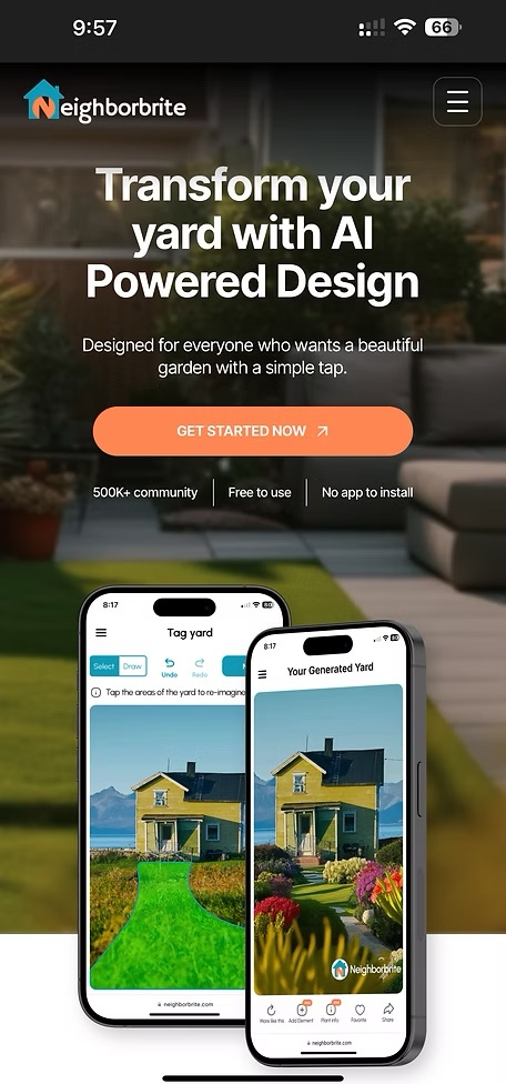
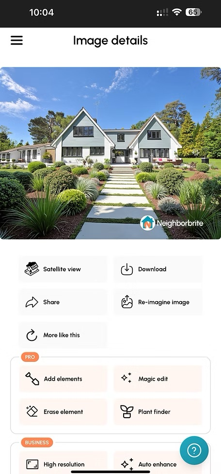
UX Designer & Researcher

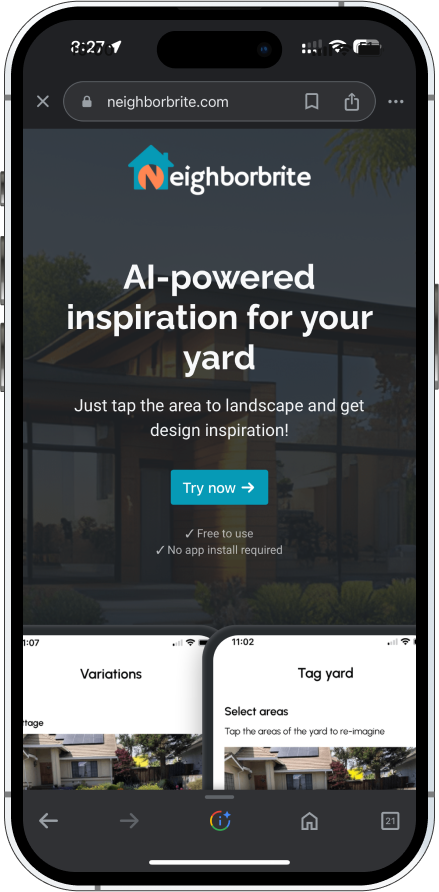
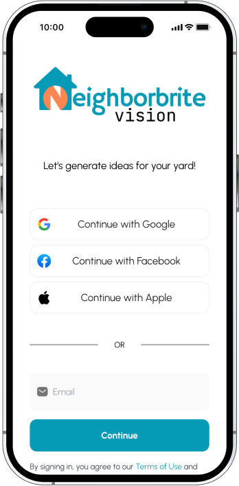
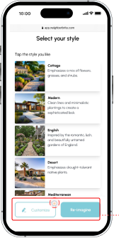
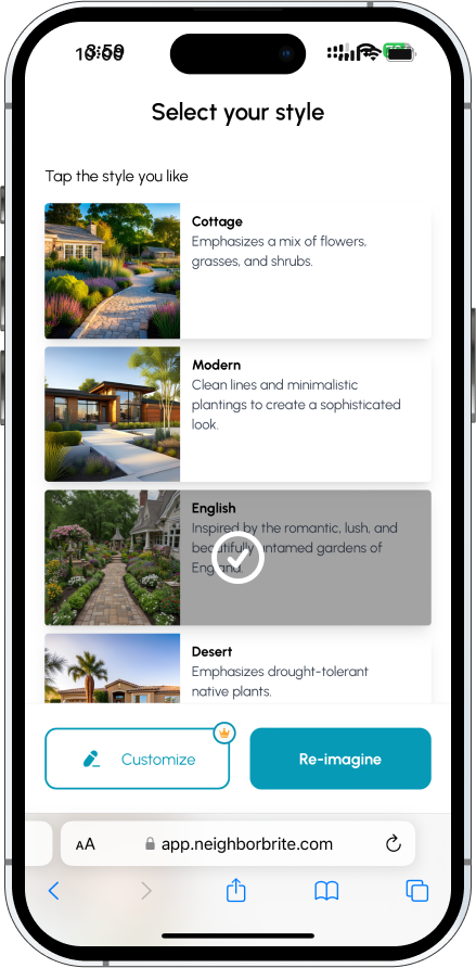
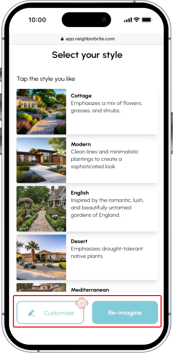
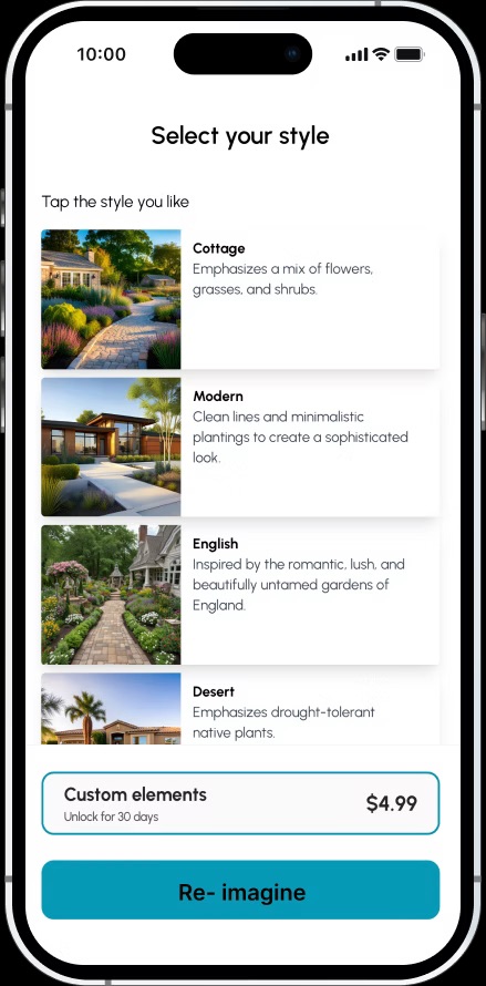
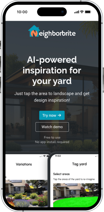
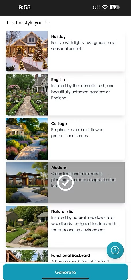
Ran user interviews and usability tests to identify friction in onboarding, login, and customization, then translated findings into a redesigned mobile flow.

  • Moderated 1:1 interviews with landscapers and homeowners over Zoom
  • Mapped behavioral patterns and validated UX issues against stakeholder hypotheses
  • Designed improved mobile flows and high-fidelity prototypes
  • Collaborated with the CEO and developers on handoff and implementation
Impact

Measured & validated

+40% Premium engagement
−75% Drop-off reduction
400K+ New users

The redesign cut early drop-offs, surfaced premium AI features, and onboarded hundreds of thousands of new mobile users.

Client

Neighborbrite

AI landscape tool

Timeline

6 weeks

Nov – Dec 2023

Team
  • 1 UX Designer + Researcher (Me)
  • 1 Visual Designer
  • 1 UX Data Analyst
  • 2 Developers
  • 1 Content Designer
  • Stakeholders
Toolkit
  • Figma
  • Zoom
  • Google Suite
The problem

Users struggled with the customization process, leading to underutilization of the platform's premium features.

…and a steep early drop-off before they ever reached the AI tools that make Neighborbrite valuable.

Problem 01

Premature login barrier.

5 of 8 hit a login wall before they understood what the tool did.

Step 1 — Neighborbrite homepage with Try now CTA
Step #1
Step 2 — Login screen blocking exploration with Continue with Google / Facebook / Apple / Email options
Step #2
Login wall first
Problem 02

Hidden AI customization features.

8 of 8 overlooked the Customize button. "Reimagine" took all the visual weight.

Select your style screen with the dominant Re-imagine button overshadowing the smaller Customize button, highlighted in red
Customize hidden
Problem 03

No onboarding guidance.

6 of 8 first-time users didn't know how to start. No walkthrough, no demo.

No demo
The solution

Redesigning the mobile experience to feel more intuitive, inviting, and frictionless from the very first tap.

Three targeted design moves: delay the login, give every core feature equal visual weight, and onboard with a clear demo before asking users to commit.

Delay login to build trust

Login moved deeper into the flow so users can explore before committing.

Improve feature discoverability

Equal weight for Customize and Reimagine. No more buried AI value.

Guided demo onboarding

A "Watch Demo" experience that teaches before the user has to try.

The process

A lean, insight-driven six-week sprint.

01 Align & Discover
Week 1
  • Stakeholder meeting with the founder
  • Customization friction framed
  • Project goals agreed
02 Plan & Prepare
Week 2
  • Research strategy outlined
  • Interview guide written
  • Scenario tasks scoped
  • Participants selected
03 Observe & Validate
Week 3–4
  • Moderated interviews
  • Behavioral patterns mapped
  • UX issues validated
04 Design & Deliver
Week 5–6
  • Redesigned flows
  • Final mockups presented
  • Client handoff report
01 / Phase One

Align & Discover

A one-on-one with the founder to identify where the customization flow was leaking users.

Stakeholder Meeting

The founder framed the engagement around three questions about the AI customization tool — these became the anchors for the rest of the research.

Q1

Friction in inspiration?

Are users facing friction when generating landscape inspiration with the AI tools?

Q2

What's missing?

What additional customization features do users expect or want from the experience?

Q3

Is premium worth it?

How do users perceive the value of premium tools and what shifts them from free to paid?

02 / Phase Two

Plan & Prepare

A qualitative research plan to dig into the friction the stakeholder briefing surfaced.

Research Goals

Three goals shaped every interview question and task scenario.

01

Map AI friction

Identify friction in the AI inspiration & customization journey.

02

Free vs premium

Uncover blockers to free vs. premium feature engagement.

03

Trust & onboarding

Evaluate trust signals and onboarding gaps for first-time users.

Research Design

A single 45-minute session per participant weaving setup, participants, and tasks together — moderated 1:1 interviews on Zoom, scenario-based exploration, and a post-test debrief.

Setup
1:1 Interview format Moderated remote sessions on Zoom, 45 min average.
Tasks Scenario-based Five tasks anchored in a "just moved into a new home" scenario.
Survey Post-test Closed each session with a short questionnaire on confidence and expectations.
Participants · 8 in total
04

Professional Landscapers

Practitioners who design and execute landscaping work for clients. Tested the AI tools against real client-facing workflows.

  • Time-saving
  • Client deliverables
  • Plant accuracy
04

Homeowners

First-time DIY landscapers exploring options for their own yard. Tested onboarding, trust, and the path to a finished design.

  • First impression
  • Trust signals
  • Confidence to commit
Scenario & tasks

"Imagine you just moved into a new home with a large yard and you're looking for inspiration." Five tasks walked each participant through the full flow.

Task 01

Upload a yard image

Open the app, get to the upload screen, and submit a photo of the yard.

Task 02

Generate AI results

Pick a style, run the AI, and explore the generated landscape designs.

Task 03

Customize as free

Explore the Customize feature as a free user. What can you change?

Task 04

Find plant info

Navigate to a plant detail page and review species, care, and growth notes.

Task 05

Customize as premium

Try the Customize experience as a premium user — does the upgrade feel worth it?

03 / Phase Three

Observe & Validate

Eight sessions surfaced three things the platform already does well — and three places it leaks users.

What worked well

Strengths to protect in the redesign. The visual identity, AI speed, and plant database all landed.

Aesthetic

Visual style read as trustworthy

7 of 8 praised the modern, clean interface.

"The design feels really polished — it's the kind of app I'd trust with my home."

AI Tools

AI customization felt fast

6 of 8 loved how quickly the AI generated landscape ideas.

"I loved how fast the AI created my garden ideas. It saved me a lot of time."

Plant Info

Plant database had everything

5 of 8 valued the quick access to species info, care tips, and growth details.

"I really liked the plant info — it had everything I needed in one spot."

Key behavioral observations

Three patterns repeated across every session, and they all disrupted the mobile experience.

Observation 01

Login wall blocked exploration

5 of 8 were blocked by a login prompt before they understood what the tool offered.

"Why do I have to sign in before I even know what this does?"

Observation 02

Customize was invisible

8 of 8 overlooked Customize. The "Reimagine" button took all the attention.

"I thought 'Reimagine' was the only option — I didn't even see Customize."

Observation 03

No onboarding direction

6 of 8 wanted a guided walkthrough or demo. Without it, the AI felt unclear.

"I'm in… now what?"

04 / Phase Four

Design & Deliver

Three recommendations to streamline the journey, build trust early, and surface the AI features that make Neighborbrite worth coming back to.

Finding #1 · Login prompt appeared too early

Users encountered a login wall before exploring the product. The friction killed momentum and inflated early drop-offs.

Before

Login first, value later

The signup screen blocked Step 2. Users had to commit before they knew what the tool did.

Original user flow
  1. 1. Home
  2. 2. Sign InDrop-off
  3. 3. Upload
  4. 4. Style
  5. 5. Customise
  6. 6. Generate
  7. 7. Plant Info
Step 1 — Neighborbrite homepage with Try now CTA
Step #1
Step 2 — Login wall with Continue with Google / Facebook / Apple options
Step #2
Recommendation

Delay the login

Move login deeper into the journey so users can upload, generate, and customize before committing. Lift the trust ceiling before the ask.

Revised user flow
  1. 1. Home
  2. 2. Upload
  3. 3. Style
  4. 4. Customise
  5. 5. Sign InDelayed
  6. 6. Generate
  7. 7. Plant Info
Step 4 — Select your style with Customize + Re-imagine actions before any login
Step #4
Step 5 — Login appears only after the user has explored and customized
Step #5

Finding #2 · Hidden customization button

Customization was overshadowed by the dominant Reimagine button. 8 of 8 users walked past the AI tool entirely.

Before

Reimagine took the stage

Reimagine was the large, contrasted CTA. Customize was a small, low-weight link below it.

Original Select Your Style screen where Re-imagine dominates and Customize is hidden
Recommendation

Equal button hierarchy

Stack Customize and Reimagine vertically with the same visual weight. Both AI tools earn an equal chance to be discovered.

Revised Select Your Style screen with a Custom elements premium card surfaced above the Re-imagine button — equal visibility for Customize and Re-imagine

Finding #3 · No onboarding support

First-time users dropped in with no context. 6 of 8 said the AI tool felt unclear from the start.

Before

Empty canvas, no guide

Users landed in a static "How it works" screen with no walkthrough. The first interaction was "figure it out yourself."

Recommendation

Watch Demo onboarding

A "Watch Demo" entry point teaches the AI flow before the user has to try. Trust-building happens before commitment.

Revised Neighborbrite homepage with a Watch demo button below Try now
The outcome

The Outcome

By delaying login, balancing the button hierarchy, and onboarding with a demo, I built a mobile flow that earns trust before asking for it — and lets Neighborbrite's AI tools do the talking.

Login delayed

Login moved from Step 1 to Step 4 — users explore before committing.

Buttons balanced

Customize and Reimagine share the spotlight. AI value is no longer hidden.

Demo on entry

A "Watch Demo" path teaches the AI flow before first use.

Result & impact

The redesign delivered.

+40% Premium engagement Customize and Reimagine now earn equal attention; premium feature usage climbed.
−75% Drop-off reduction Removing the early login wall kept first-time users in the flow.
400K+ New users Post-launch growth across the redesigned mobile experience.

The redesign made our AI tool feel so much more accessible. Users are finally discovering features we worked hard to build.

Luis · Founder & CEO, Neighborbrite
Reflections

Trust is built before the user has to act.

Designing for an AI-powered product taught me that small decisions early in the journey have outsized impact. Delaying a login. Equalizing two buttons. Adding a demo. Each one tiny on its own — together they unlocked the engagement the platform had been missing.

I also learned to let the product speak before asking the user to commit. When the AI got a chance to demonstrate value first, users opted in willingly. That's a pattern I'll carry into every AI-first product I touch.

Good design for AI isn't about hiding the machinery, it's about making the machinery feel inviting from the very first tap.

Next case study

SkillsPe

Designing a skill-based gaming iOS app from the ground up — onboarding, challenges, leaderboards, and reward progression.