Back to all work
Case study · 2021–2022

SkillsPe

Turning a complex gameplay concept into an intuitive, scalable iOS experience — built from scratch, iterated with players, and shipped to a 95% App Store rating.

About the project

Meet SkillsPe

SkillsPe is a social, skill-based challenge app where players compete with friends, apply analytical thinking, and earn real rewards through interactive gameplay. The product blends learning and competition into a single mobile loop — one that has to feel fast, fair, and worth coming back to.

My role

Product Designer

Owned the SkillsPe iOS app end-to-end — from translating an early product vision into a complete mobile experience to shipping and measuring it in the App Store.

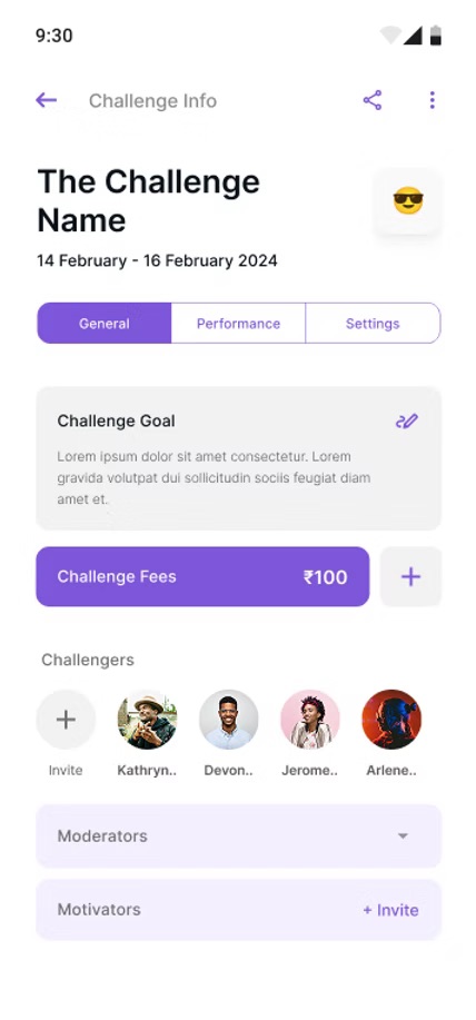
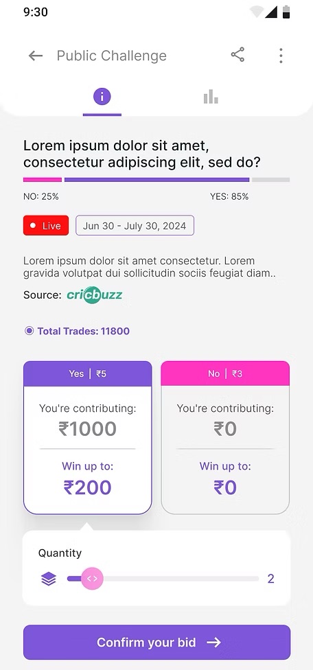
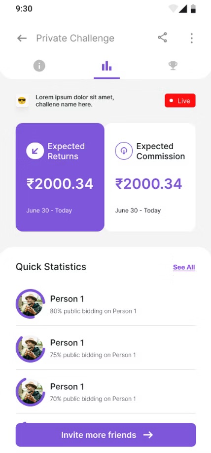
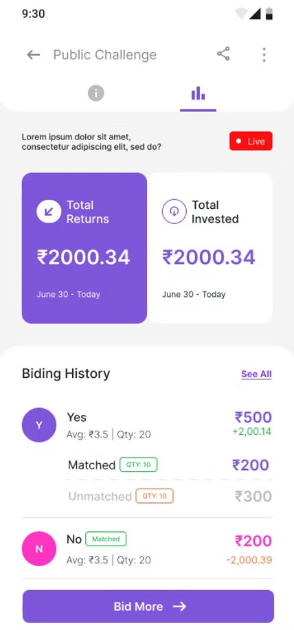
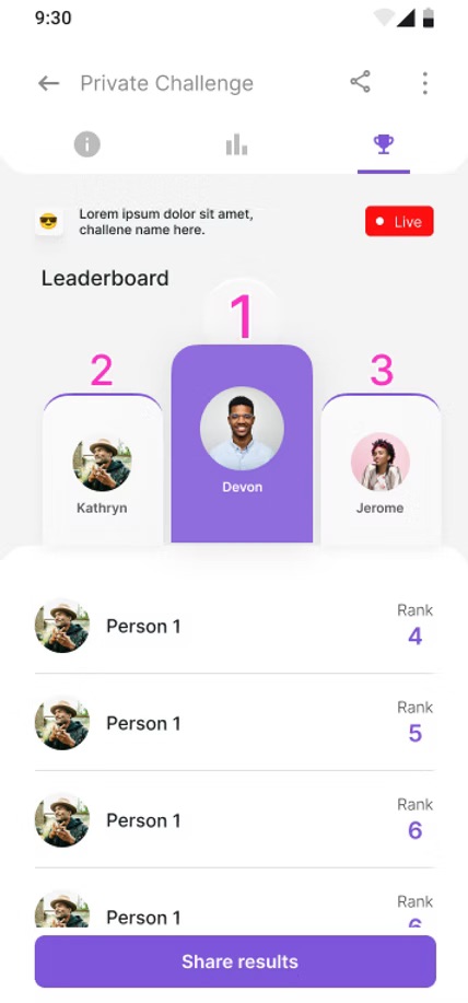
  • Defined the core user journeys, IA, and interaction models across onboarding, challenges, bidding flows, and leaderboards
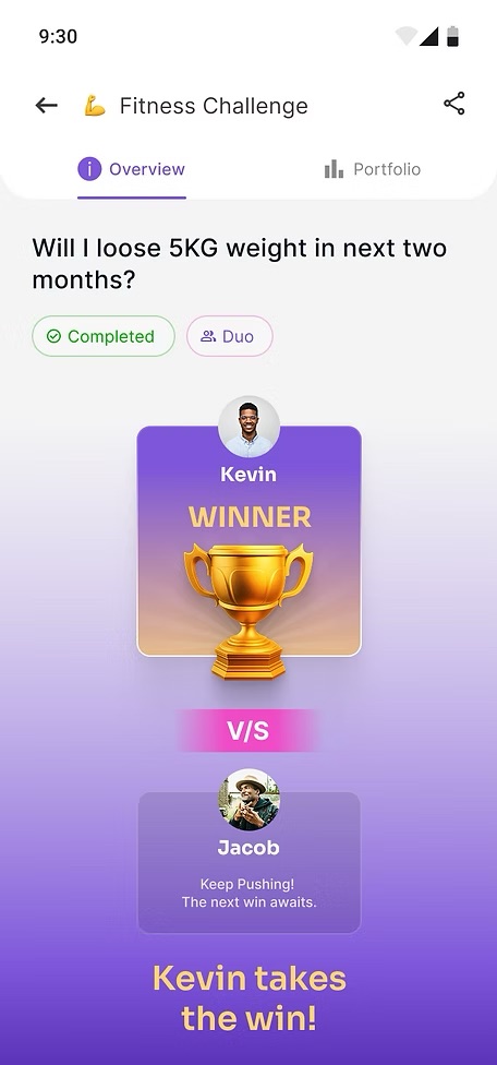
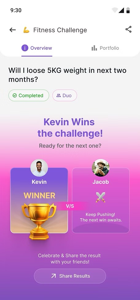
  • Ran iterative usability testing and gameplay validation to refine reward mechanics and progression
  • Partnered with engineering, content, and the founder to ship a polished iOS product
  • Tracked retention, session time, and store rating post-launch to measure outcomes
Impact

Measured & validated

95% App Store rating
+20% User retention
+30% Avg. session time

Research-led product design that lifted retention, deepened sessions, and turned curious downloads into committed players.

Client

SkillsPe

Skill-based gaming app · iOS

Timeline

2 years

Jan 2021 – Dec 2022

Team
  • 1 Product Designer (Me)
  • 1 Visual Designer
  • 2 Developers
  • 1 Content Designer
  • Stakeholders
Toolkit
  • Figma
  • Google Analytics
  • Slack
  • Google Suite
The problem

A bold gameplay concept — buried under complex flows and unclear mechanics.

Early prototypes asked too much of new players. Bidding logic, reward tiers, and challenge formats lived in dense menus. Players were curious enough to download — but couldn't get to a first win fast enough to stick around. Retention stalled. Sessions ended early.

Problem 01

First-time confusion.

No onboarding momentum — new players bounced before understanding how challenges worked.

SkillsPe landing page — the entry point that left new players asking what to do first
No first win
Problem 02

Dense gameplay mechanics.

Bidding, scoring, and reward logic competed for attention on one screen.

Challenge info card stacked with rules and timing — the kind of dense layout that overwhelmed new players
Cognitive overload
Problem 03

Weak reward feedback.

Players couldn't see progress — wins felt the same as losses. Motivation flatlined.

Original completion summary — a pair of screens that handed players a result without a celebration
Flat motivation
The solution

Make it fast to start, easy to read, and rewarding to return to.

Three core moves: a clear onboarding flow that walks players to a first win, a stripped-back challenge UI that surfaces only what matters at each step, and a progression system that turns every interaction into visible momentum.

Guided first win

A 60-second onboarding flow that gets every new player to a finished challenge.

Distilled mechanics

Bidding, scoring, and rules collapsed into intuitive, one-decision-per-screen flows.

Visible progression

Reward states, completion screens, and leaderboards that make every win feel earned.

The process

A three-phase product design sprint, over two years.

01 Discover & Define
Phase 1
  • Founder & stakeholder alignment
  • Player interviews + competitor scan
  • Friction mapped across the gameplay loop
  • Design principles defined
02 Design & Iterate
Phase 2
  • IA + journey maps
  • Wireframes → high-fidelity flows
  • Usability testing across rounds
  • Reward + progression mechanics refined
03 Launch & Measure
Phase 3
  • iOS handoff & design QA
  • App Store submission & launch
  • Retention + session-time tracking
  • Live-product iteration loop
01 / Phase One

Discover & Define

Aligned with the founder, talked to players, and pinpointed where the gameplay loop was breaking.

Three questions to answer

The founder framed the engagement around three big unknowns — these became the anchors for every research interview, design decision, and shipped feature.

Q1

Where do players drop?

Which step in the challenge loop loses the most players, and why?

Q2

What feels worth it?

How do players perceive the value of a win — and what makes them return to play another challenge?

Q3

What gets in the way?

Which interactions feel heavy — bidding, scoring, leaderboards — and where can we reduce the load?

Key behavioral observations

Three patterns repeated across every session and shaped the redesign brief.

Observation 01

No first-win loop

New players didn't reach a finished challenge in their first session.

"I downloaded it, opened it, and just… closed it. I didn't know what to do."

Observation 02

Bidding felt like math

The bidding interface stacked numbers, rules, and outcomes on a single screen.

"There's too much going on. I don't want to do calculations to play a game."

Observation 03

Wins didn't feel like wins

Reward states reused the same layout as ordinary screens. There was nothing to celebrate.

"I think I won? It just took me back to the home screen."

02 / Phase Two

Design & Iterate

From journey maps to high-fidelity flows — every screen tested, every interaction earned its place.

Design principles

Three rules I held the design to — used to break ties whenever a flow felt overloaded.

P1

One decision per screen

Cognitive load only goes one direction — down.

P2

Earn the celebration

Every win needs a moment that makes the player feel the win.

P3

Show, don't say

Animation, color, and rhythm explain mechanics faster than copy ever can.

Pivot · From a flat menu to a guided challenge loop

The original flow treated every screen as equal. The redesign turned it into a linear sprint — pick, play, win, repeat.

Before

Flat menu, dense mechanics

Bidding, rules, and reward logic all surfaced at once. Players had to read before they could play.

Original menu — rules, timing, and stakes all stacked on a single dense screen
After

Linear challenge loop

Each step earns its own screen — challenge brief → bid → live state → completion → reward. The player only ever has to make one decision at a time.

Redesigned Create Challenge screen — a single, clear decision per step in the new linear loop
03 / Phase Three

Launch & Measure

Shipped to the App Store, then watched the data to see what actually moved.

What moved post-launch

Three signals confirmed the redesign was doing its job — retention, depth, and reviews.

Signal 01

Players came back

+20% user retention — the guided first-win flow turned curious downloads into repeat sessions.

Signal 02

Sessions ran longer

+30% avg. session time — clearer mechanics turned quick taps into engaged play.

Signal 03

Reviews stayed strong

95% App Store rating — players called out clarity, polish, and the feel of skill-based competition.

The outcome

A more intuitive, enjoyable experience — built screen by screen.

A tour through the shipped flows: challenge entry, live play, completion, leaderboards, and the portfolio that lets players see their progress at a glance.

Result & impact

The redesign delivered.

95% App Store rating Players praised clarity, polish, and the feeling of skill-based competition.
+20% User retention The guided first-win loop kept new players in the app long enough to commit.
+30% Avg. session time Clearer mechanics turned curious taps into longer, more engaged sessions.
Reflections

Designing for play is designing for momentum.

SkillsPe taught me that gaming products live or die in the first 60 seconds. If a new player doesn't reach a small win quickly, they don't come back — no matter how rich the mechanics are downstream. Shaping the path to the first win became the most valuable design call I made on this project.

I also learned that mechanics aren't features to explain — they're feelings to design for. Bidding wasn't a math screen; it was a moment of stakes. A leaderboard wasn't a table; it was a reason to play tomorrow. Letting those feelings drive the layout (instead of the data) is what made the app feel like a game and not a calculator.

Two years, one shipped iOS product, and a tight feedback loop with real players — that's the work. The metrics moved because the screens did.

Next case study

One Degree Impact

Rebuilding a non-profit's web experience around founder-led research and a cohesive design system.