Back to all work
Case study · 2024

One Degree Impact

Transforming a single-page site into a personalized membership experience.

About the project

Meet One Degree Impact

Since 2003, One Degree Impact has provided full-service grant management for non-profit organizations across the United States. With over 20 years of experience in the non-profit sector, they are committed to fostering human connection and community, a core aspect of the One Degree Impact brand.

My role

Lead Product Designer

End-to-end ownership: research, IA, interaction, visual design, and final handoff.

  • Led 8 moderated usability sessions
  • Owned the pivot from static tiers to a calculator
  • Built the design system that shipped with the site
  • Wrote the final copy in partnership with the founder
Impact

Measured & validated

97.5% Task success
4.18/5 Satisfaction
85.3 SUS score

All three validated in round-two testing with 8 participants, a mix of existing members and new prospective clients.

Client

One Degree Impact

Grant management for non-profit organizations

Timeline

12 weeks

Research → Final handoff

Team
  • 1 Product Designer (Me)
  • 1 Visual Designer
  • 1 UX Writer
  • 1 Content Strategist
  • 3 Developers
  • Stakeholders
Toolkit
  • Figma
  • Wix Studio
  • FigJam
  • Google Analytics
  • Notion
  • Loom
The problem

The website failed to communicate their mission, services, and flexible membership plans.

…leading to confusion among both new and existing clients.

Problem 01

Ineffective branding & lack of connection

The visual identity didn't reflect ODI's two decades of trust-building or its commitment to community, leaving the brand feeling generic and forgettable.

One Degree Impact original site, branding screenshot
Problem 02

Personalized membership plans weren't communicated

ODI's flexible, tailored pricing was a unique differentiator, but it was buried in dense copy and difficult to evaluate at a glance.

ODI website membership pricing buried inside long blocks of dense paragraph copy
Problem 03

Single-page site with anchor-only navigation

Every menu item linked to a section on the homepage. There was no real information architecture, and no room to scale as the organization grew.

One Degree Impact homepage, full single-page scroll
Problem 04

Focused on new clients, neglecting existing

The site was built to convert prospects, but offered nothing to returning clients trying to access resources, blogs, or the YouTube content library.

One Degree Impact original site, focused on new clients
The solution

A multi-page experience that communicates clearly and scales with growth.

Reflect ODI's commitment to human connection and community while clearly communicating their flexible, tailored services to both new and existing clients.

Humanize the brand

Warm, mission-driven visuals with ODI's signature dot motif.

Personalize the journey

Multi-step path selection with preview content.

Surface the resources

Dedicated Resources Hub for blogs, videos, worksheets.

Serve returning members

Member-only area with tier-based weekly content.

The process

A structured four-stage approach.

01 Discover
Week 1–2
  • Stakeholder interviews
  • Competitive audit
  • Heuristic review
  • Goals alignment
02 Define
Week 3
  • User personas
  • Journey mapping
  • Opportunity areas
  • Success metrics
03 Design
Week 4–6
  • IA + sitemap
  • Low-fi wireframes
  • Hi-fi mockups
  • Design system
04 Deliver
Week 7–8
  • Prototype
  • Usability testing
  • Iteration
  • Handoff
01 / Phase One

Exploratory Research & Discovery

I needed to understand ODI's people, their clients, and the state of the existing site before touching pixels.

Research Goals

Before speaking to anyone, I defined four concrete questions the research had to answer. Every interview, audit, and analytics pull mapped back to one of these.

01

Understand the current experience

How do new and returning clients perceive the existing site today? What's working and what's creating friction?

02

Map the information gap

What questions do visitors arrive with that the current content fails to answer? Where does clarity break down?

03

Surface the invisible

Which valuable resources, services, and personalization already exist but aren't being seen by the people they're for?

04

Validate the pivot potential

Is the current tier-based model actually serving clients, or is there appetite for something more flexible?

Stakeholder interviews & ecosystem mapping

Initial meetings surfaced ODI's vision, challenges, and expectations for the new website. I then mapped the full ecosystem: stakeholder relationships, communication flows, and ownership gaps.

Stakeholder interviews

Three guiding principles to shape the redesign

Based on interviews with ODI leadership and practitioners, I defined the strategic anchors below. Three guiding principles that drove every subsequent design decision.

Three guiding principles for the ODI redesign
Three guiding principles · strategic anchors for the redesign
Ecosystem map

Stakeholder relationships & communication flows

Mapping ODI's full ecosystem surfaced the friction points, ownership gaps, and critical touchpoints that shaped product strategy, and made clear which relationships the website needed to support.

Ecosystem map of ODI's stakeholder relationships
Stakeholder relationships & communication flows

Technical analysis

I audited the existing site for usability and accessibility issues. Two findings drove the restructure.

Finding #1

A single-page WordPress site

Every navigation menu item linked to an anchor on the same homepage. No depth, no scalability, no way to support a growing resource library.

Mismatch between main navigation order and homepage content order
Finding #2

Valuable resources were buried

Blogs, worksheets, and the YouTube channel lived in the footer, completely invisible to users. Returning clients couldn't find content they had paid for.

Valuable resources buried in the footer of the original ODI site

Qualitative & Quantitative Research

I conducted moderated qualitative interviews with current clients, paired with quantitative behavioral analytics from Google Analytics.

Qualitative

Moderated user interviews

1-on-1 interviews with four existing clients, focused on two areas:

1

Impressions as new clients

Emotional connections and key brand qualities that influenced the decision to engage with ODI.

2

Current website usability

How well the existing site meets the needs of both new and returning users.

Quantitative

Behavioral analytics

I analyzed Google Analytics data to supplement qualitative feedback: where users dropped off, which pages got traffic, which resources were discovered or missed.

Google Analytics: users vs. new users over the past 90 days
Key findings

Three themes that shaped every design decision that followed.

Finding 01

The ODI story isn't clear.

Even existing clients struggled to articulate what ODI does, let alone what makes them different. The brand voice didn't carry through the site experience.

"Site could do a better job of telling the ODI story, why they do what they do and how they're different."

"I can't really tell what this organization does… is it coaching, consulting, or a community?"

Finding 02

Personalized memberships are invisible.

ODI's biggest differentiator, tailored membership plans built around each non-profit's needs, wasn't visible anywhere on the site. Clients felt that disconnect immediately.

"What I love about ODI is how they really get to know you and tailor their support to what you need. But if you look at their website, you wouldn't get that sense. It's more one-size-fits-all."

"It doesn't look like you can customize anything. Isn't that the whole point?"

Finding 03

Highlighted resources were buried.

Blogs, articles, and the YouTube channel, content ODI invested heavily in, sat in the footer, completely undiscovered. Clients only found them by accident.

"It's all there: blogs, resources, YouTube content. But no one can find it."

"I didn't even know there were blogs and videos here. I scrolled to the bottom by accident and found them."

02 / Phase Two

Strategy & Schematic Design

With research synthesized, I turned insights into structure: a platform architecture, a new information architecture, and mid-fidelity prototypes of the key experiences.

Product Architecture

The single-page structure couldn't scale or surface content clearly. I redesigned the platform into a multi-page system aligned with user journeys, and centralized ODI's educational materials into a structured Resources Hub to make them discoverable.

Product architecture: overlap of new and existing client journeys
Product architecture · overlap of new and existing client journeys

Information Architecture

I rebuilt the IA into five top-level sections — mission, services, membership, resources, and contact — to surface the buried content and cut navigation friction. The new structure gives new users a clear path to discover and returning members a streamlined route back in.

One Degree Impact information architecture diagram
Information architecture · 5 top-level sections · 30 sub-pages · global Sign In

Mid-Fidelity Prototyping

I wireframed the primary experience layers (Homepage, About, Membership, Testimonials, Resources) and prototyped three membership frameworks to tackle the hardest problem: how to communicate flexible pricing. We selected the dynamic Membership Calculator, shifting pricing from static tiers to user-driven configuration to increase clarity and perceived control.

View Figma prototype Mid-fidelity wireframes for three membership plan options
Key workflow 3 · Membership plan options · three explored frameworks
03 / Phase Three

Evaluative Research & Validation

Iterative usability testing with real clients to refine the flow, hierarchy, and trust signals before final handoff.

Usability Testing: 8 Participants, 2 Rounds

Eight participants across two rounds of moderated testing. The first round surfaced blockers in navigation and tier-model comprehension; the second validated fixes after iteration.

02

Existing Clients

Tested continuity of trust, resource discoverability, and member-area recognition after the redesign.

  • Continuity
  • Trust signals
  • Resource findability
06

New / Prospective Clients

Tested first-impression clarity, understanding of membership tiers, and the decision path to "become a member."

  • First impression
  • Tier comprehension
  • Conversion path

Task Success & Key Metrics

Task success 97.5% Across 8 core tasks
Avg. satisfaction 4.18/5 Post-test survey
SUS score 85.3 System Usability Scale
Time on task −42% vs. the live site
Three participant quotes praising layout clarity, conciseness, and reading speed
Participant feedback from round-two moderated testing

What Changed After Round 1

Three specific fixes came out of the first round. Each was re-tested in round two and all passed.

Navigation
What broke

Users couldn't locate resources from the home page without using search.

How I fixed it

Promoted Resources into the primary nav and added a clear footer link.

Tier model
What broke

Static 3-tier pricing felt restrictive. Users wanted to mix-and-match services to fit their goals.

How I fixed it

Pivoted to a Membership Calculator where clients configure their own plan.

Hierarchy
What broke

Value proposition was buried. 6 of 8 scrolled past without engaging the headline.

How I fixed it

Rewrote the headline with a concrete statement about ODI's outcomes.

04 / Phase Four

Final Design & the Pivot

The moment the chosen direction gave way to a better one.

The strategic pivot

Stakeholders chose the Membership Calculator, a dynamic flow that let users configure their own pricing. I prototyped it end-to-end and carried it into handoff.

"This isn't working the way we thought it would."

Realization at handoff

Seeing the calculator land in context exposed the trade-offs: it increased cognitive load, slowed decisions, and added complexity that didn't fit ODI's simpler service model. With the team, I led the transition back to the Modular Tier Model, simpler pricing with flexibility through opt-in add-ons.

Initial bet

Membership Calculator

Dynamic, user-driven pricing. Powerful in concept, multi-step and cognitively heavy in practice.

Initial Membership Calculator design with services table comparing Introductory and Custom tiers
After pivot

Modular Tier Model

Tiered pricing with opt-in add-ons. The flexibility of the calculator, without the friction.

Final Modular Tier Model showing Foundational, Expanded, and Growth-focused membership plans

The pivot became the defining moment of the project. Design isn't about staying loyal to one idea, it's about staying flexible, listening, and evolving.

The outcome

The Final Redesign

A warm, member-first website built across desktop and mobile. It tells the ODI story, surfaces the full offering, and lets practitioners build the support they actually need.

High-fidelity desktop and mobile prototypes for the final One Degree Impact redesign
High-fidelity prototypes · desktop home, mobile flows
Result & impact

Measured impact, validated by users.

97.5% Task Success Across 8 core user tasks in round-two testing. Every blocker from round one was cleared.
4.18/5 Satisfaction Post-test survey average across all 8 participants. Highest scores on clarity and trust.
85.3 SUS Score System Usability Scale — "excellent" range. +12 points over the live site benchmark.

Trisha brought clarity to something we'd been circling for years. She listened carefully, challenged our assumptions, and delivered a site that finally tells our story, and makes it easy for the right people to find us.

Founder & CEO · One Degree Impact
Reflections

Design goes beyond aesthetics.

ODI taught me to hold user needs and business realities in the same hand, translating a complex membership model into a clear, human-centered experience.

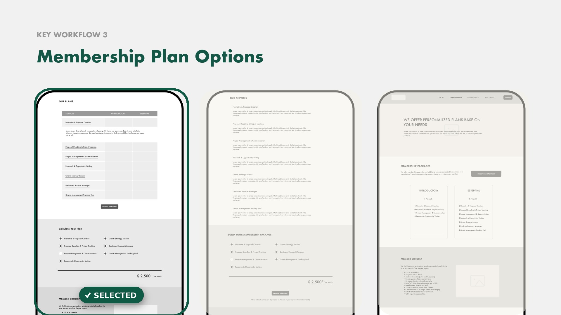
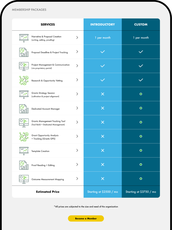
When the Membership Calculator stopped fitting ODI's strategy, the pivot became the project's defining moment. Design isn't about staying loyal to one idea, it's about staying flexible, listening, and evolving.

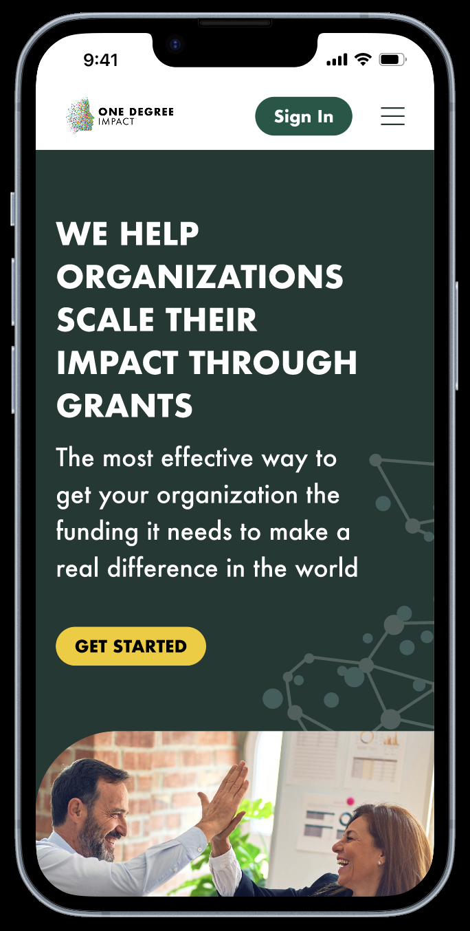
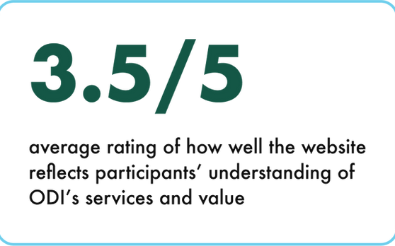
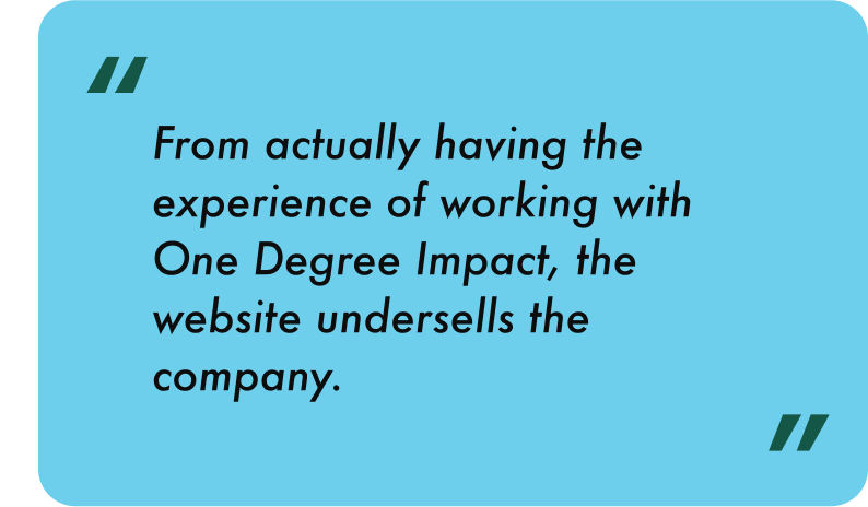
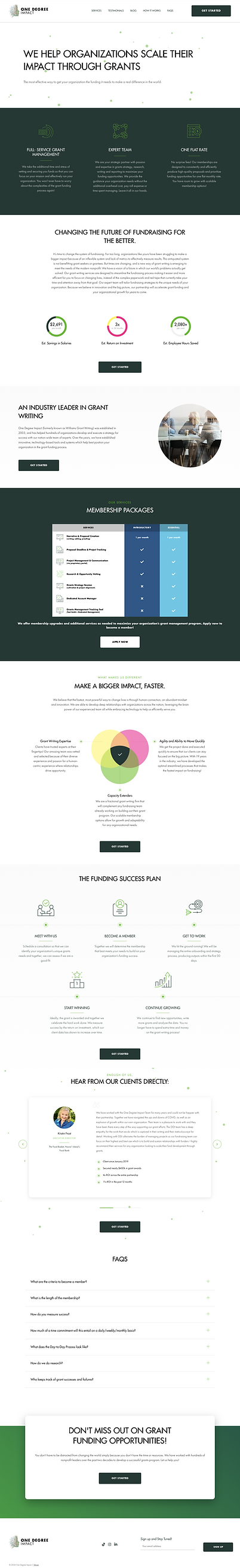
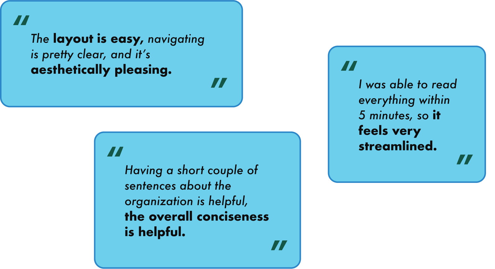
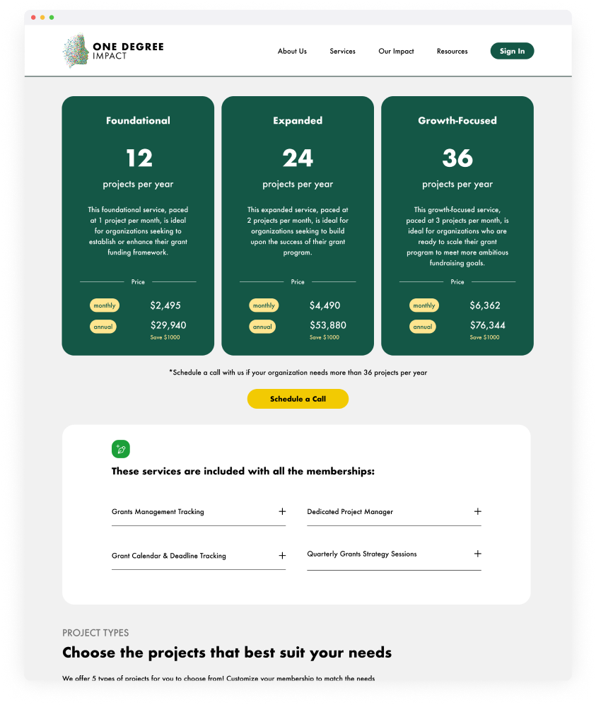
Through close collaboration and iterative testing, I shipped a site that improved usability and strengthened ODI's brand voice and trust with the people it serves.

Meaningful design happens when empathy and strategy work hand in hand, when every interaction reflects both purpose and people.

Next case study

Words Without Borders

Reimagined a fragmented mobile experience into a user-first, research-driven platform that amplifies diverse voices worldwide.